DORA & Cycle time
The DORA & Cycle Time Dashboard is a tool that visually presents DevOps Research and Assessment (DORA) metrics and cycle time to assess development and deployment efficiency, including deployment frequency, lead time, and failure rate. It helps teams optimize their software deployment process by tracking performance across DORA metrics and cycle time, identifying areas for improvement in each phase.
DORA & Cycle time dashboard
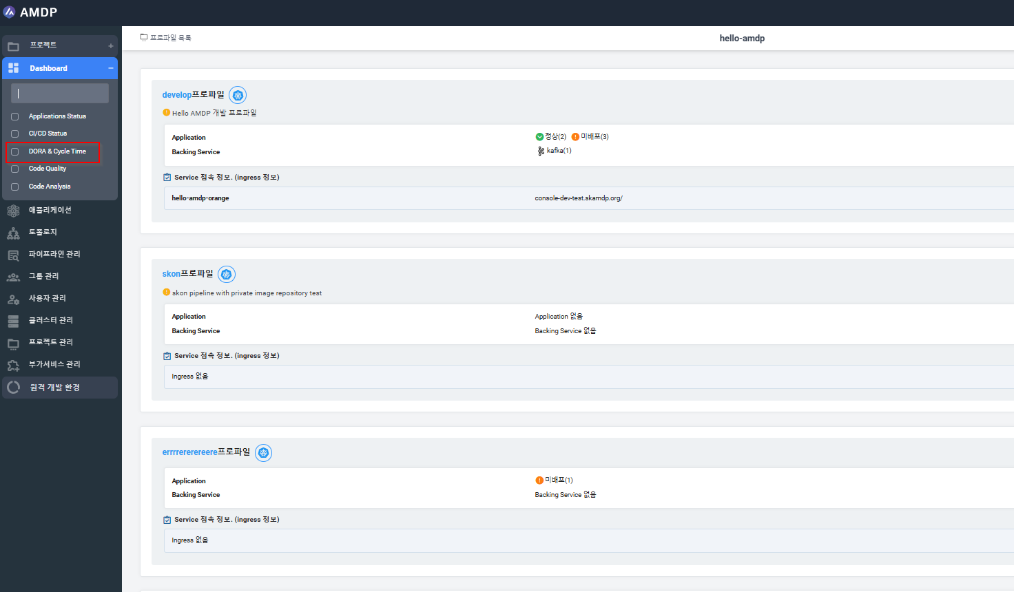
From the Sidebar Menu, select the Dashboard/DORA & Cycle time:
Key functions
From the DORA & Cycle time Dashboard, below actions can be performed:
-
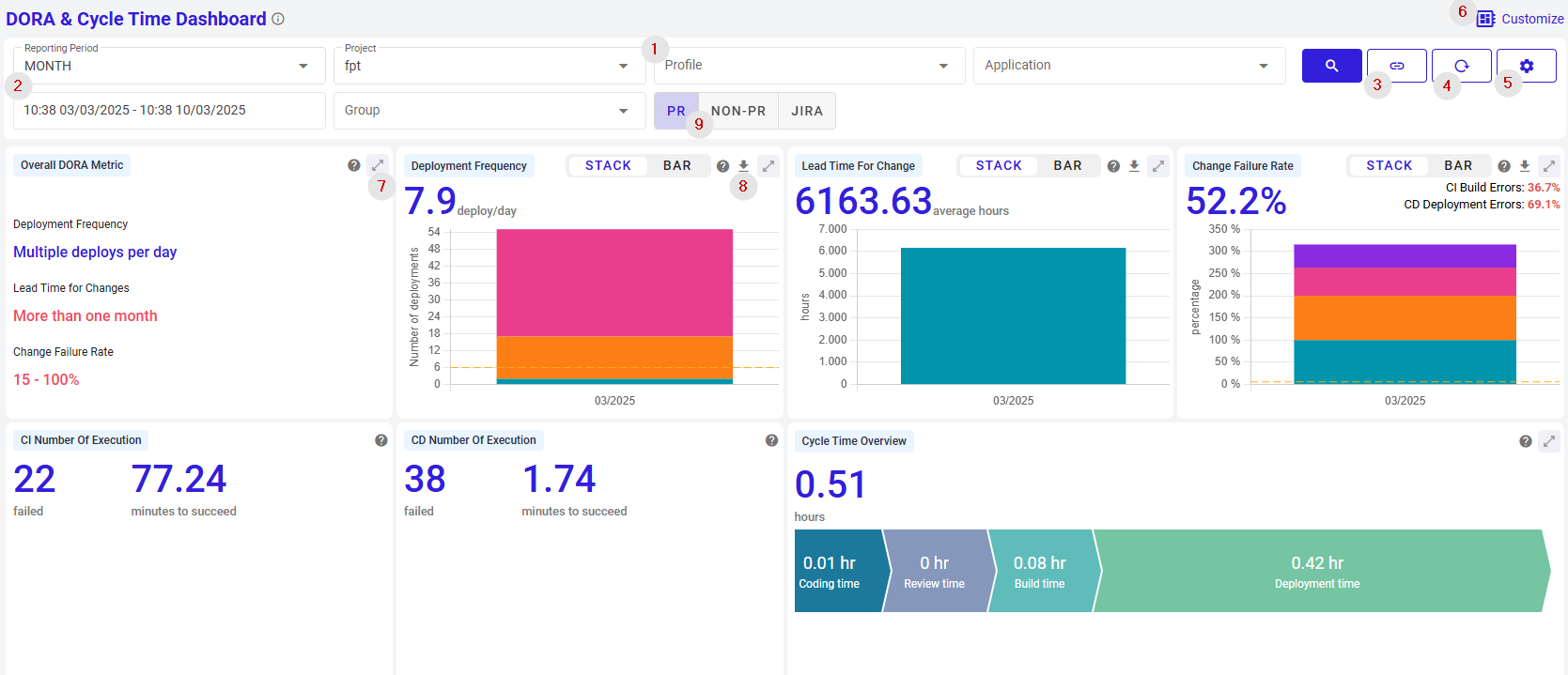
Search for a report, which is:
- Filtered by Project
- Filtered by Project and Profile of project
- Filtered by Project and Profile and application of profile
- Filtered by Project and Group of project
- Filtered by Project and Profile, group of project
-
View report by customized time:
- Sorted by Period ( Day, Week, Month, Year)
- Sorted by specific date time set by user
- Sorted by suggested time ranges: Last 2 weeks, 2 hours…
-
Copy URL of DORA & Cycle time dashboard.
-
Reset the dashboard:
When click on button Reset, all the data selected in terms of project, profile, application, Group and Time duration selected are reset.
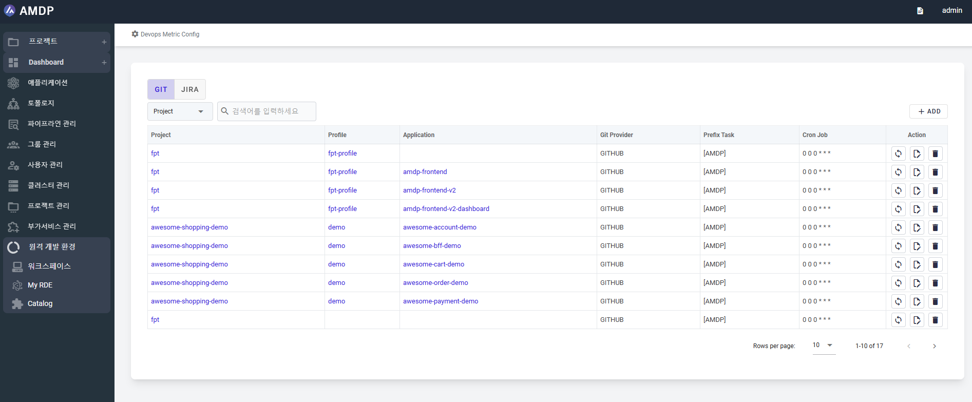
- Configure Devops Metric:
Allow user to navigate to Devops Metric Config screen, which allow user to view project detail, profile detail, application detail, create new config, fetch the sync manually, edit config and delete config.
- Customize the displayed report by enable or disable charts/tables:
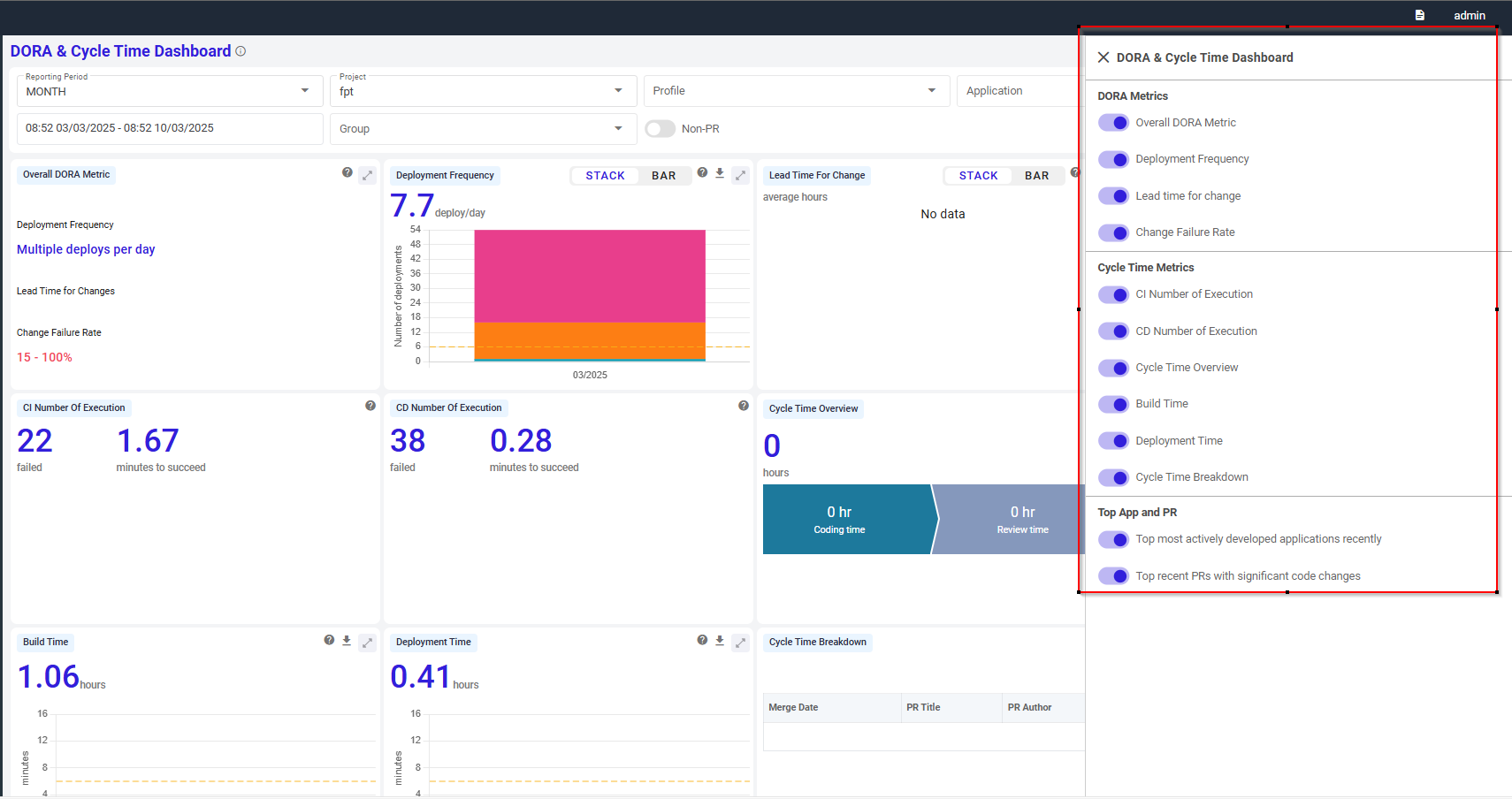
-
Expand a specific report chart on Dashboard.
-
Export to .csv file regarding:
- Deployment Frequency
- Lead Time for Change
- Change Failure Rate
- Build Time
- Deployment Time
- Cycle Time Breakdown
- Top Most Actively Developed Applications Recently
- Top Recent PRs With Significant Code Changes
-
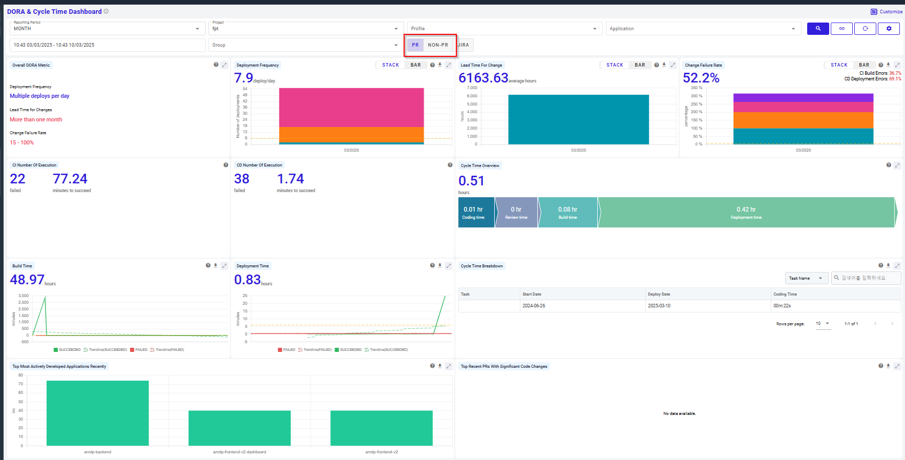
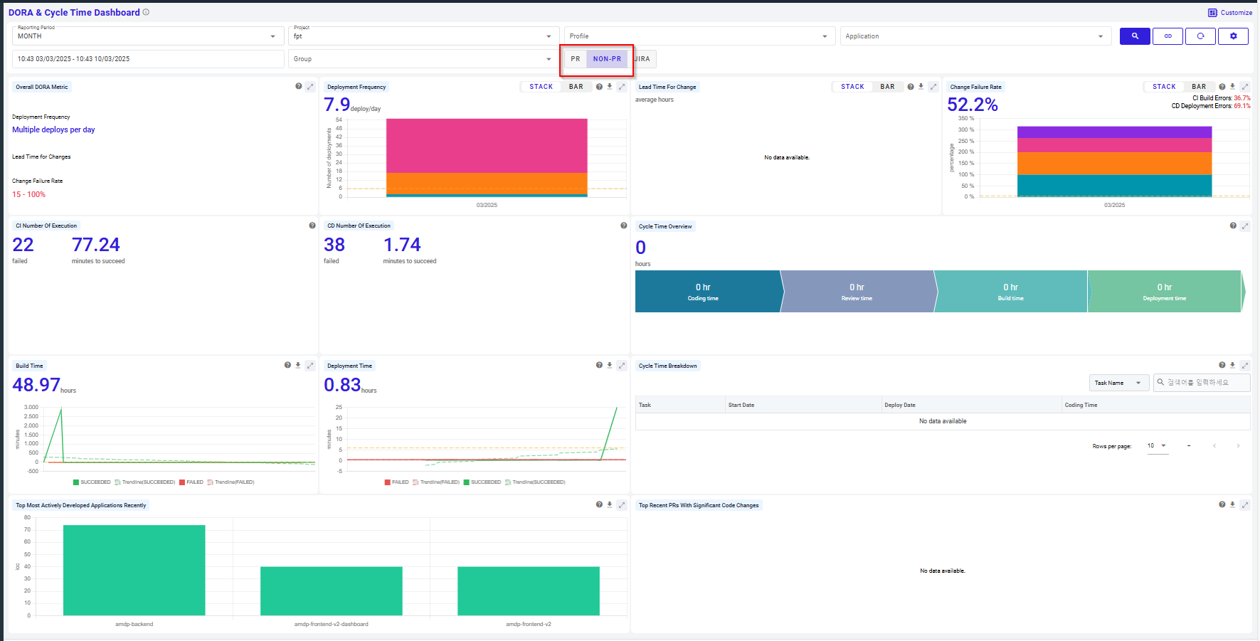
Switch between PR (Pull Request) and Non-PR( Non Pull Request) mode
By default, dashboard is displayed on PR mode:
To switch to mode Non-PR:
With mode PR: board illustrates the data of commits from pull request, which are parts of a pull request workflow, typically used for code review before merging into the main branch.
With non PR: board illustrates the data of commits without pull request, these are direct commits (e.g., pushed directly to the main branch or another branch) not associated with any pull request.
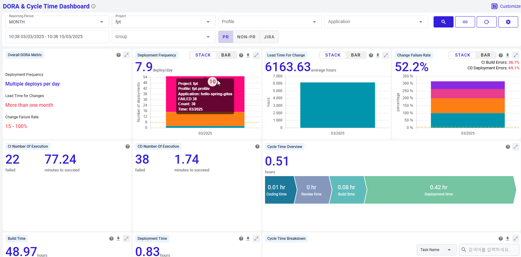
- Show detailed parameters of the chart (if have) by holding over the dashboard:
Key components
This dashboard is useful for DevOps teams to monitor DORA metrics and cycle time, enabling them to evaluate the performance of their software deployment process. Key components include:
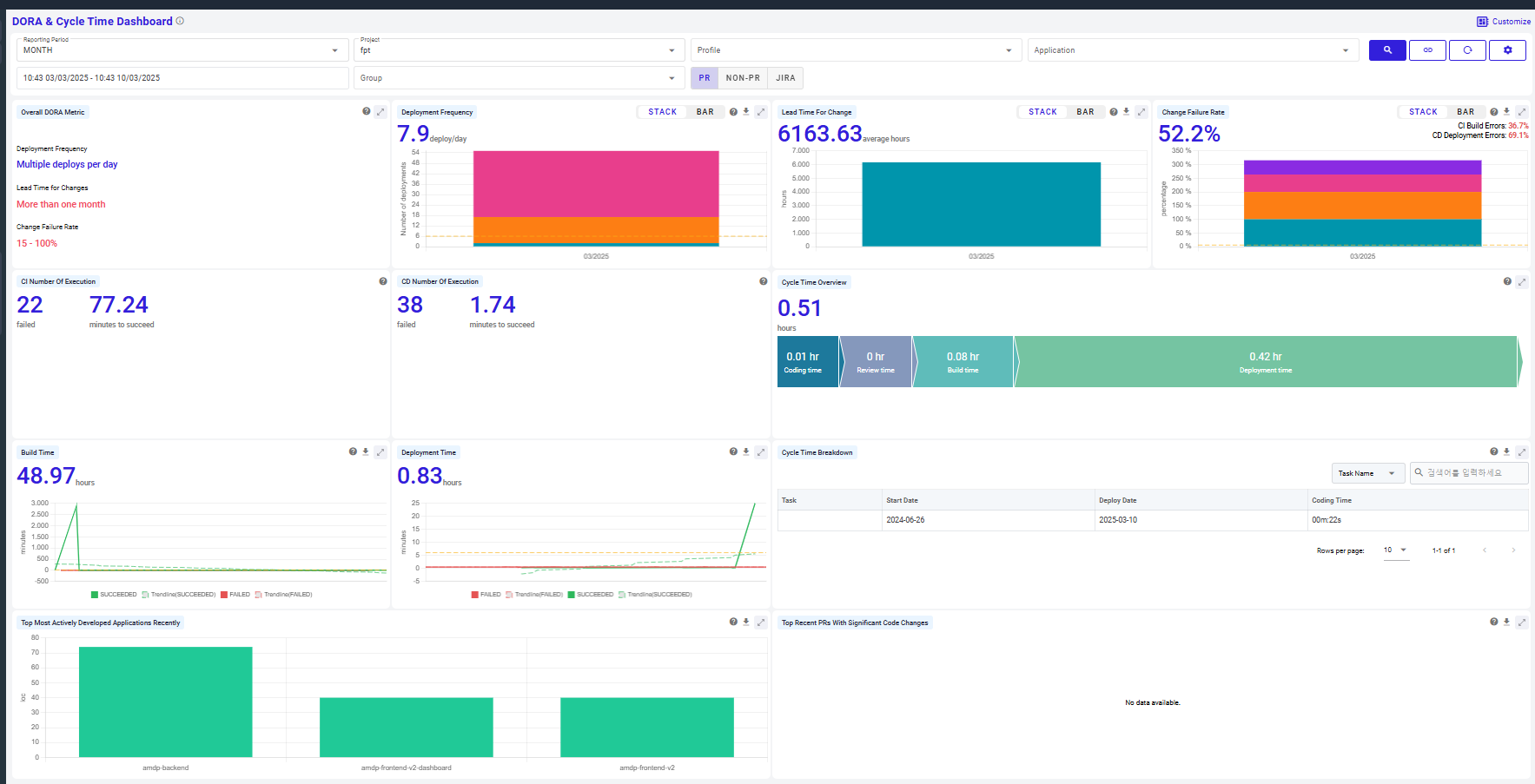
Overall DORA Metric: Summarizes deployment frequency, change lead time, and change failure rate to display DevOps maturity.
- Deployment Frequency: Shows the frequency of multiple deployments per day.
- Lead Time for Changes: Indicates the average time taken for changes to be deployed, typically between one day and one week.
- Change Failure Rate: Shows the percentage of failed changes.
These metrics are categorized into four levels: Low, Medium, High, and Elite. Each metric reflects the current standing of the organization, with the expanded view allowing users to see all levels and thereby evaluate the organization’s performance at a glance
Deployment Frequency: Helps to assess how well an organization is maintaining its deployment velocity and where there may be room for improvement.
This chart graphically displays the count of each deployment over the reporting period (day, week, month, year), counting only successful deployments.
- Y-axis : Represents the details the reporting period.
- X-axis : Lists the number of deployments, and the number in the top left corner reflects the average deployment rate per time period
Lead Time for Change: Displays the average lead time for changes in hours.
The duration reflects the time it takes for changes to start delivering value to customers and is a crucial indicator of the efficiency of the development process.
A shorter average Lead Time indicates faster value delivery and quicker feedback collection. Conversely, a longer Lead Time can suggest bottlenecks or inefficiencies in the process.
The value presented in this chart represents the average Lead Time in hours, reflecting the overall speed and efficiency of the development and deployment processes during the given period.
Change Failure Rate: Shows the change failure rate over time with a bar chart, displaying both success and failure rates. This metric is derived from the incidents or issues that occur post-implementation of changes in production, serving as an indicator of DevOps maturity and process quality.
- Y-axis : Displays the reporting period set in DAY, WEEK, MONTH, YEAR intervals
- X-axis : Shows the percentage of error rates for CI (Continuous Integration) and CD (Continuous Deployment)
CI Number Of Execution Displays the number of failed and successful executions in CI and CD builds.
The 'CI Number Of Execution' chart provides a summary of the continuous integration (CI) execution results. This chart displays two key metrics: the number of failed executions and the average time to succeed in minutes.
- Failed Executions: The count of CI runs that failed during the specified period.
- Minutes to Succeed: The average time in minutes taken for CI runs to complete successfully.
This chart is essential for monitoring the health and efficiency of the CI process. By tracking the number of failures and the time to succeed, teams can quickly identify issues and make necessary improvements to maintain a smooth and efficient CI pipeline.
CD Number Of Execution : The 'CD Number Of Execution' chart provides a summary of the continuous deployment (CD) execution results. This chart displays two key metrics: the number of failed executions and the average time to succeed in minutes.
- Failed Executions: The count of CD runs that failed during the specified period.
- Minutes to Succeed: The average time in minutes taken for CD runs to complete successfully.
This chart is essential for monitoring the health and efficiency of the CD process. By tracking the number of failures and the time to succeed, teams can quickly identify issues and make necessary improvements to maintain a smooth and efficient CD pipeline.
Cycle Time Overview: Visually breaks down the total cycle time into coding, review, build, and deployment time.
The 'CD Number Of Execution' chart provides a summary of the continuous deployment (CD) execution results. This chart displays two key metrics: the number of failed executions and the average time to succeed in minutes.
- Failed Executions: The count of CD runs that failed during the specified period.
- Minutes to Succeed: The average time in minutes taken for CD runs to complete successfully.
This chart is essential for monitoring the health and efficiency of the CD process. By tracking the number of failures and the time to succeed, teams can quickly identify issues and make necessary improvements to maintain a smooth and efficient CD pipeline.
Build Time: Visualizes the time taken for each build, showing trends and variability.
The 'CD Number Of Execution' chart provides a summary of the continuous deployment (CD) execution results. This chart displays two key metrics: the number of failed executions and the average time to succeed in minutes.
- Failed Executions: The count of CD runs that failed during the specified period.
- Minutes to Succeed: The average time in minutes taken for CD runs to complete successfully.
This chart is essential for monitoring the health and efficiency of the CD process. By tracking the number of failures and the time to succeed, teams can quickly identify issues and make necessary improvements to maintain a smooth and efficient CD pipeline.
Deployment Time: Shows deployment times for each deployment in hours.
The 'CD Number Of Execution' chart provides a summary of the continuous deployment (CD) execution results. This chart displays two key metrics: the number of failed executions and the average time to succeed in minutes.
- Failed Executions: The count of CD runs that failed during the specified period.
- Minutes to Succeed: The average time in minutes taken for CD runs to complete successfully.
This chart is essential for monitoring the health and efficiency of the CD process. By tracking the number of failures and the time to succeed, teams can quickly identify issues and make necessary improvements to maintain a smooth and efficient CD pipeline.
Cycle Time Breakdown: Provides details such as PR creation date, title, author, and coding/review times.
The 'Cycle Time Breakdown' chart is a table format chart that provides a detailed view of the cycle time for individual PRs (Pull Requests). This chart includes various metrics for each PR, helping to analyze and monitor each stage of the development process.
- Merge Date: Indicates the date the PR was merged.
- PR Title: Indicates the title of the PR.
- PR Author: Indicates the name of the person who created the PR.
- Coding Time: Indicates the time spent writing the code.
- Review Time: Indicates the time spent reviewing the code.
- URL: Provides the GitHub link to the PR.
This table allows for the analysis and improvement of cycle times by examining the details of each PR. For example, it helps identify PRs with long coding and review times, enabling process optimization.
Top Most Actively Developed Applications Recently: Displays the most actively developed applications in a bar chart.
The 'Cycle Time Breakdown' chart is a table format chart that provides a detailed view of the cycle time for individual PRs (Pull Requests). This chart includes various metrics for each PR, helping to analyze and monitor each stage of the development process.
- Merge Date: Indicates the date the PR was merged.
- PR Title: Indicates the title of the PR.
- PR Author: Indicates the name of the person who created the PR.
- Coding Time: Indicates the time spent writing the code.
- Review Time: Indicates the time spent reviewing the code.
- URL: Provides the GitHub link to the PR.
This table allows for the analysis and improvement of cycle times by examining the details of each PR. For example, it helps identify PRs with long coding and review times, enabling process optimization.
Top Recent PRs With Significant Code Changes: Lists recent PRs with significant code changes.
The 'Cycle Time Breakdown' chart is a table format chart that provides a detailed view of the cycle time for individual PRs (Pull Requests). This chart includes various metrics for each PR, helping to analyze and monitor each stage of the development process.
- Merge Date: Indicates the date the PR was merged.
- PR Title: Indicates the title of the PR.
- PR Author: Indicates the name of the person who created the PR.
- Coding Time: Indicates the time spent writing the code.
- Review Time: Indicates the time spent reviewing the code.
- URL: Provides the GitHub link to the PR.
This table allows for the analysis and improvement of cycle times by examining the details of each PR. For example, it helps identify PRs with long coding and review times, enabling process optimization.