Dashboard - Fleet
The GPU Fleet Overview screen provides a centralized view of the overall health, utilization, and performance of the cluster. It allows administrators to monitor the status of all GPUs and nodes in real time, detect anomalies, and quickly identify potential issues affecting workloads or infrastructure stability.
Access GPU Fleet Overview
From the main navigation, click GPU. Then select GPU Monitoring > Dashboard > GPU Fleet Overview to open the GPU Fleet Overview dashboard:
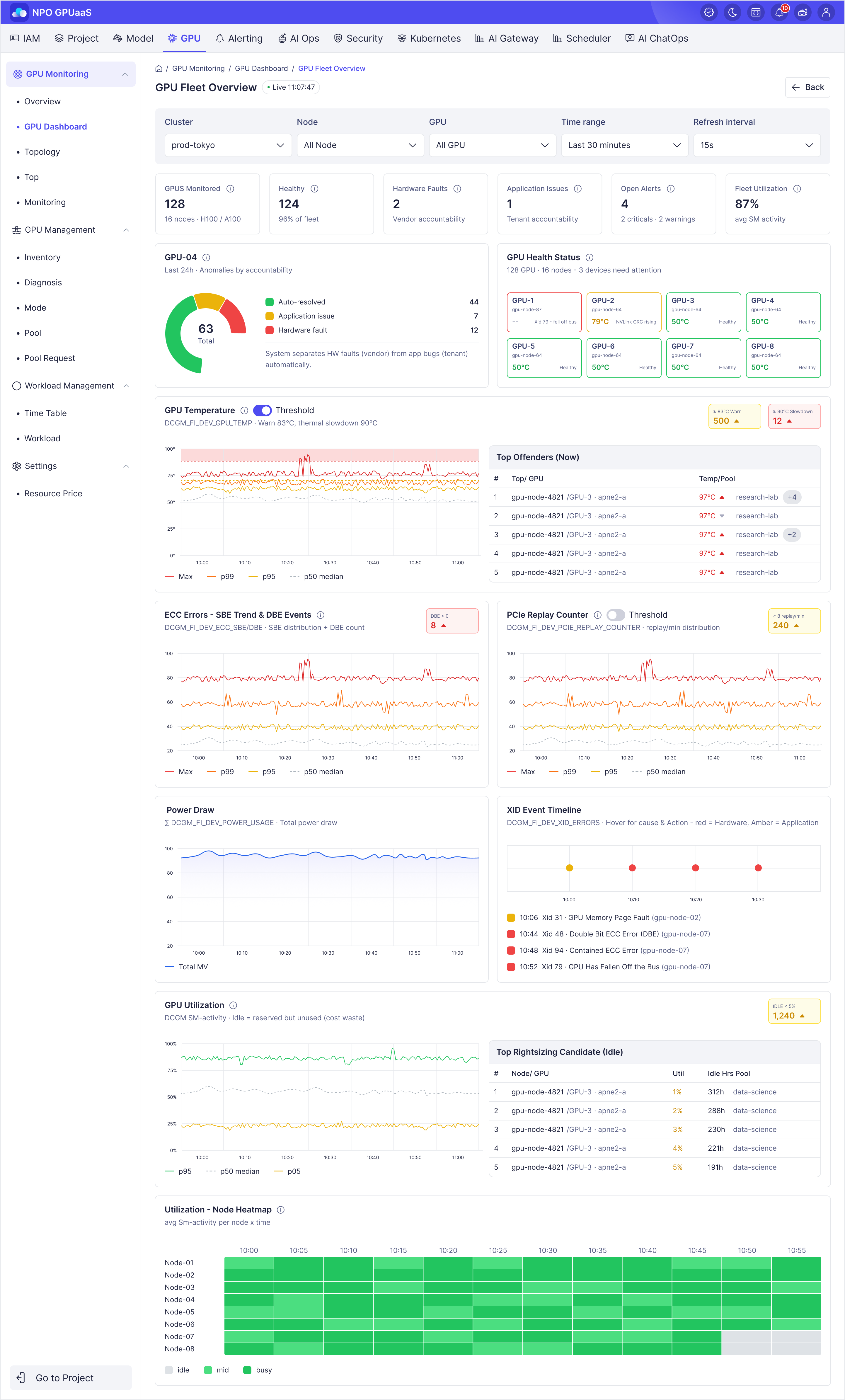
Filters and Time Controls
You can use the filter function to narrow the scope of monitoring:
- Cluster: Select a specific cluster or all clusters
- Node: View data for a specific node or all nodes
- GPU: Filter by a specific GPU or all GPUs
- Time range: Set the monitoring window such as the last 30 minutes
- Refresh interval: Set the auto-refresh rate, such as every 15 seconds
These filters allow administrators to focus on the relevant resource group and track operational changes over time.
Summary Metric Cards
The summary metrics are displayed in a row of cards, each representing one key metric:
- GPU Monitored: Shows the umber of GPUs currently monitored.
- Healthy: Shows the number of GPUs that are currently healthy (Excellent or Good status).
- Hardware Faults: Shows the total number of GPUs with hardware-related issues.
- Application Issues: Shows the number of GPUs impacted by application-related problems.
- Open Alerts: Shows the of open alerts by priority, not filtered by time range.
- Fleet Utilization: Shows the average SM activity across the GPU fleet.
These cards are designed for rapid operational review and support quick decision-making.
GPU Pool Health Overview
This panel summarizes the GPU health status in the selected cluster.
Header
- Display cluster name
- Subtitle: Last 24h · Anomalies by accountability
Donut Chart
The donut chart represents the distribution of GPU states over the last 24 hours:
- Auto-resolved
- Application issue
- Hardware fault
It provides a quick visual summary of the percentage and number of GPUs in each state.
GPU Health Status
This card provides an overall health overview of GPUs in the cluster, helping users quickly identify which devices are operating normally and which may require attention.
Each tile represents a single GPU and displays:
- GPU Name: GPU-1, GPU-2, ...
- Device ID: gpu-node-87, gpu-node-64, ...
- Temperature: 50°C, 79°C, ...
- Green: Healthy
- Yellow: Requires attention
- Red: Hardware failure or critical issue detected
GPU Temperature Chart
This chart describes the temperature distribution of the entire fleet at each point in time. Each line on the chart represents a percentile metric, helping users quickly assess the thermal status of the whole system.
Legend:- 🔴 max — Highest temperature (red)
- 🟠 p99 — 99th percentile (orange)
- 🟡 p95 — 95th percentile (yellow)
- ⚫ p50 median — 50th percentile / median (gray)
Meaning of each line on the chart
🔴 Max (Highest temperature)- The highest temperature recorded across all GPUs at that moment.
- How it’s computed: take the maximum temperature value within that time window.
If max = 97°C, that means at least 1 GPU is at 97°C.
🟠 P99 (99th percentile)- 99% of GPUs have a temperature less than or equal to this value. Only 1% of GPUs are hotter than this value.
- Example: P99 = 89°C ⇒ 9,900 GPUs ≤ 89°C, only 100 GPUs > 89°C.
- How it’s computed:
- Step 1: Sort temperatures in ascending order
- Example: 45, 46, 46, 47, ... , 89, ... , 97
- Step 2: Compute the P99 position
- Formula: Position = N (number of GPUs) × 99%
- Example: 10,000 × 0.99 = 9,900 ⇒ take the 9,900th GPU
- Step 3: Determine the value
- Example: The 9,900th value is 89°C ⇒ P99 = 89°C
- Step 1: Sort temperatures in ascending order
- 95% of GPUs have a temperature less than or equal to this value. Only 5% of GPUs are hotter than this value.
- Example: P95 = 85°C ⇒ 9,500 GPUs ≤ 85°C, only 500 GPUs > 85°C.
- How it’s computed:
- Step 1: Sort GPU temperatures in ascending order
- Example: 45, 46, 46, 47, ... , 84, ... , 89, ... , 97
- Step 2: Compute the P95 position
- Formula: Position = N (number of GPUs) × 95%
- Example: 10,000 × 0.95 = 9,500 ⇒ take the 9,500th GPU
- Step 3: Determine the value
- Example: The 9,500th GPU temperature is 84°C ⇒ P95 = 84°C
- Step 1: Sort GPU temperatures in ascending order
- 50% of GPUs have a temperature less than or equal to this value. This reflects the “typical baseline” of the entire fleet.
- Example: P50 = 70°C ⇒ half the fleet ≤ 70°C, half ≥ 70°C.
- How it’s computed:
- Step 1: Sort GPU temperatures in ascending order
- Example: 45, 46, 46, 47, ... , 70, ... , 89, ... , 97
- Step 2: Compute the P50 position
- Formula: Position = N (number of GPUs) × 50%
- Example: 10,000 × 0.50 = 5,000 ⇒ take the 5,000th GPU
- Step 3: Determine the value
- Example: The 5,000th GPU temperature is 70°C ⇒ P50 = 70°C
- Step 1: Sort GPU temperatures in ascending order
Detail Information
- GPUs ≥ 83°C WARN Count: Displays number of GPUs reporting temperature at or above warning threshold (83°C) on selected time range.
- GPUs ≥ 90°C SLOWDOWN Count: Displays number of GPUs at or above thermal slowdown threshold (90°C) on selected time range.
- Show/hide threshold button ⇒ Only display the thresholds corresponding to the selected cluster.
- Top Offenders Table: Lists GPU nodes with highest temperatures (display top 5 only), sorted descending by Temperature].
| STT | Column Name | Remark |
|---|---|---|
| 1 | NODE / GPU | Node and specific GPU identifier. |
| 2 | TEMP | Current measured temperature in °C • Highlights in red when ≥ 90°C • Highlights in yellow when ≥ 83 °C |
| 3 | POOL | Logical pool or usage area of the GPU node (e.g., research-lab, ml-platform). |
Note:
- If the rank is a whole number, go to that specific position in your sorted list.
- If the rank has a decimal, round up to the next whole number.
ECC Errors - SBE Trend & DBE Events
This chart shows the distribution of ECC errors in the form of SBE (Single-bit Errors) across the entire GPU fleet over time. Each line on the chart represents a percentile metric of SBE, allowing users to quickly see the overall SBE level in the fleet: how bad the “worst” errors are and what level most of the fleet is at.
In addition, DBE (Double-bit Errors) is shown on the card in the right corner as DBE > 0 (number of GPUs with DBE).
Meaning of each line on the chart (SBE metrics)
Legend (SBE distribution)- 🔴 max — Highest SBE in the fleet (red)
- 🟠 p99 — 99th percentile SBE (orange)
- 🟡 p95 — 95th percentile SBE (yellow)
- ⚫ p50 median — 50th percentile SBE (gray)
- The highest SBE value recorded across all GPUs at that time.
- How it’s computed: take the maximum SBE value in the fleet at that timestamp.
Example: If max = 28, it means at least 1 GPU has SBE = 28.
🟠 P99 (99th percentile SBE)- 99% of GPUs have SBE ≤ this value. Only 1% of GPUs have SBE > this value.
- Example (fleet of 10,000 GPUs): P99 = 9 ⇒ 9,900 GPUs ≤ 9, only 100 GPUs > 9.
-
How it’s computed:
- Sort SBE values in ascending order (per GPU at that time) Example: 0, 0, 0, 1, …, 9, …, 28
- Compute the P99 position: Position = N (number of GPUs) × 99%
- Determine the value
- 95% of GPUs have SBE ≤ this value. Only 5% of GPUs have SBE > this value.
- Example (fleet of 10,000 GPUs): P95 = 4 ⇒ 9,500 GPUs ≤ 4, only 500 GPUs > 4.
-
How it’s computed:
- Sort SBE values in ascending order
- Compute the P95 position: N × 95%
- Take the value at that position ⇒ P95
- 50% of GPUs have SBE ≤ this value. This is the “typical baseline” SBE level of the fleet.
- Example: P50 = 0 ⇒ at least half the fleet has SBE = 0 (at that time).
-
How it’s computed:
- Sort SBE values in ascending order
- Compute the P50 position: N × 50%
- Take the value at that position ⇒ P50 (median)
Note:
- If the rank is a whole number, go to that specific position in your sorted list.
- If the rank has a decimal, round up to the next whole number. Internal registry entries are typically published from existing internal runtime instances, not created from this Add Agent form.
DBE Count
Counts the number of GPUs with DBE > 0 within the corresponding time window and displays it on the card, along with an icon indicating the trend.
Power Draw
This chart shows the total power consumption of the entire GPU fleet over time. Each point on the line represents the total power draw (in MW) of all GPUs included in the fleet at that timestamp, helping users quickly monitor overall electricity usage and load fluctuations over time.
Meaning of the line on the chart
🔵 total MW (Total fleet power)The total power usage of all GPUs in the fleet at that time (summed across GPUs).
How the data is computed:
- Each GPU reports the metric DCGM_FI_DEV_POWER_USAGE (W).
- At a given timestamp, take the power usage of each GPU and sum them up:
- Total_W(t) = Σ PowerUsage_i(t) (i ranges over all GPUs in the fleet)
- Then convert to MW:
- Total_MW(t) = Total_W(t) / 1,000,000
Suppose at 10:15 there are 10,000 GPUs:
- The total power across all GPUs is 6,100,000 W
- Convert to MW: 6,100,000 / 1,000,000 = 6.1 MW
⇒ If the chart displays ~6.1 MW, it means the entire fleet is consuming about 6.1 megawatts at that moment.
PCIe Replay Counter
This chart describes the distribution of the PCIe Replay Counter (replays/min) across the entire GPU fleet over time. Each line on the chart represents a percentile metric of replays/min, helping users quickly see the fleet’s replay level: what the worst case (max) is and where most of the fleet sits (p50/p95/p99).
Legend (PCIe replays/min distribution)- 🔴 max — highest replays/min in the fleet (red)
- 🟠 p99 — 99th percentile of replays/min (orange)
- 🟡 p95 — 95th percentile of replays/min (yellow)
- ⚫ p50 median — 50th percentile of replays/min (gray dashed)
Meaning of each line on the chart
🔴 Max (highest replays/min)
- This is the highest replays/min value observed across all GPUs at that time.
- How the data is computed: take the maximum replays/min value in the fleet at that timestamp.
Example: if max = 9, it means at least 1 GPU has replays/min = 9.
🟠 P99 (99th percentile of replays/min)
- 99% of GPUs have replays/min ≤ this value. Only 1% of GPUs have replays/min > this value.
- Example (fleet of 10,000 GPUs): P99 = 10 ⇒ 9,900 GPUs ≤ 10, only 100 GPUs > 10.
-
How to compute the value:
- Sort replays/min in ascending order (per GPU at that time) Example: 20, 21, 21, 22, …, 60, …, 95
- Compute the P99 position: N × 99% (e.g., 10,000 × 0.99 = 9,900 ⇒ take the 9,900th GPU)
- The value at that position is P99
🟡 P95 (95th percentile of replays/min)
- 95% of GPUs have replays/min ≤ this value. Only 5% of GPUs have replays/min > this value.
- How to compute the value:
- Sort replays/min in ascending order
- Compute the P95 position: N × 95% (e.g., 10,000 × 0.95 = 9,500)
- Take the value at that position ⇒ P95
- 50% of GPUs have replays/min ≤ this value. This is the “baseline” replay level for the entire fleet.
- Example: P50 = 2.7 ⇒ at least half of the fleet has replays/min ≤ 27 at that time.
-
How to compute the value:
- Sort replays/min in ascending order
- Compute the P50 position: N × 50% (e.g., 10,000 × 0.50 = 5,000)
- Take the value at that position ⇒ P50 (median)
Note:
- If the rank is a whole number, go to that specific position in your sorted list.
- If the rank has a decimal, round up to the next whole number.
GPU Utilization
This chart describes the distribution of GPU Utilization (DCGM SM activity) across the entire GPU fleet over time. Each line on the chart is a percentile metric of utilization, helping users quickly see: how busy most of the fleet is and what the low-utilization level (idle floor) looks like.
Legend (GPU utilization distribution)- 🟢 p95 — 95th percentile of “busy” utilization (green)
- ⚫ p50 median — 50th percentile (median) utilization (gray dashed)
- 🟡 p05 — 5th percentile (floor/idle group) utilization (yellow)
Meaning of each line on the chart
🟢 P95 (95th percentile utilization)
- 95% of GPUs have utilization ≤ this value; only 5% of GPUs are higher than this level.
- Example (fleet of 10,000 GPUs): P95 busy = 88% ⇒ 9,500 GPUs ≤ 88%, 500 GPUs > 88%.
- How to compute the value:
- Sort utilization in ascending order by GPU at that timestamp
- P95 position = N × 95%
- Take the value at that position ⇒ P95
- 50% of GPUs have utilization ≤ this value. This is the “baseline” utilization level of the fleet.
- Example: P50 = 55% ⇒ at least half of the fleet has utilization ≤ 55% at that time.
-
How to compute the value:
- Sort utilization in ascending order
- P50 position = N × 50%
- Take the value at that position ⇒ P50 (median)
🟡 P05 (5th percentile utilization)
- 5% of GPUs have utilization ≤ this value.
- Example (fleet of 10,000 GPUs): P05 = 2% ⇒ 500 GPUs have utilization ≤ 2%.
-
How to compute the value:
- Sort utilization in ascending order
- P05 position = N × 5%
- Take the value at that position ⇒ P05
Note:
- If the rank is a whole number, go to that specific position in your sorted list.
- If the rank has a decimal, round up to the next whole number.
Idle Information card
IDLE < 5%: The card shows the number of GPUs currently below this utilization threshold.
Top Rightsizing Candidate (Idle)
This table lists nodes/GPUs that show signs of prolonged idleness to prioritize cost optimization.
- Node/GPU: node and GPU identifier
- Util: utilization level (e.g., 5%)
- Idle Hrs: total accumulated idle hours (e.g., 312h)
- Pool: owning group/tenant/pool (e.g., data-science)
XID Event Timeline
This chart displays GPU error events over time within a selected time range. Each dot on the timeline represents a specific incident.
- Each point represents an event that occurred at a specific point in time.
- Amber: Application-related errors or issues potentially caused by software.
- Red: Critical hardware failures that require immediate attention.
Utilization - Node Heatmap
X-axis (Time)- Displays timestamps within the selected time range.
- Each column represents the average utilization during that time interval.
Displays individual nodes within the selected cluster.
Heatmap Cells- Each cell represents the average SM Activity of a specific node during a specific time interval.
- Color intensity indicates utilization level:
| Color | Status | Threshold | Description |
|---|---|---|---|
| Gray | Idle | 0% – 4.9% | No workload or minimal GPU activity |
| Light Green | Mid | 5% – 79.9% | Moderate GPU utilization |
| Dark Green | Busy | 80% – 100% | High GPU utilization |
Calculation Method
Step 1: Calculate the average SM Activity for each GPU within the time bucket
Avg_SM_Activity_GPU = SUM(SM Activity samples)/ Number of samplesStep 2: Calculate the average SM Activity for the Node
Node_SM_Activity = SUM(Avg_SM_Activity_GPU_i)/ Number of GPUs in NodeThe resulting Node_SM_Activity is used as the value for the corresponding heatmap cell.